Using Graphic Design to Win Hearts and Minds: Is it Possible for Government?
POSTED ON July 24th, 2013 BY Lisa Duba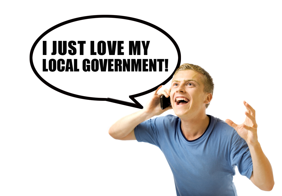 According to the U.S. government’s own definition, graphic designers “create visual concepts, by hand or using computer software, to communicate ideas that inspire, inform, or captivate consumers.”
But how often do government communications actually inspire or captivate?
Our clients often say they want to “educate” or “inform” residents about their program. But in behavior change, we know that merely providing information does not guarantee action. We know we need to inspire and persuade — not just inform — and design plays a big role in meeting this challenge.
That said, we acknowledge there’s a time and place for just providing information, such as rate increases or service changes. In these cases, direct mail of a simple letter in an official envelope is the best way to cut through the clutter.
But when it comes to increasing participation in programs — from recycling and composting to planting trees — government should give creativity free rein. Here government agencies need to establish an emotional connection with the audience to overcome old habits, win over hearts and minds, and inspire change.
But wait, you say, “we need to look like we’re being responsible with taxpayer [or ratepayer] money, so we can’t do anything flashy or frivolous.” At Gigantic, we firmly believe there is a creative solution that is both engaging and appropriate, for every type of environmental campaign funded by public agencies. In fact, we’d argue that you could be wasting taxpayer money by not making it captivating. If no one notices your outreach, there’s no point in doing it.
And, we’d argue that a human-centered, thought provoking and positive concept — presented through a clutter-free design with professional imagery — has the best chance of attracting fans to your programs.
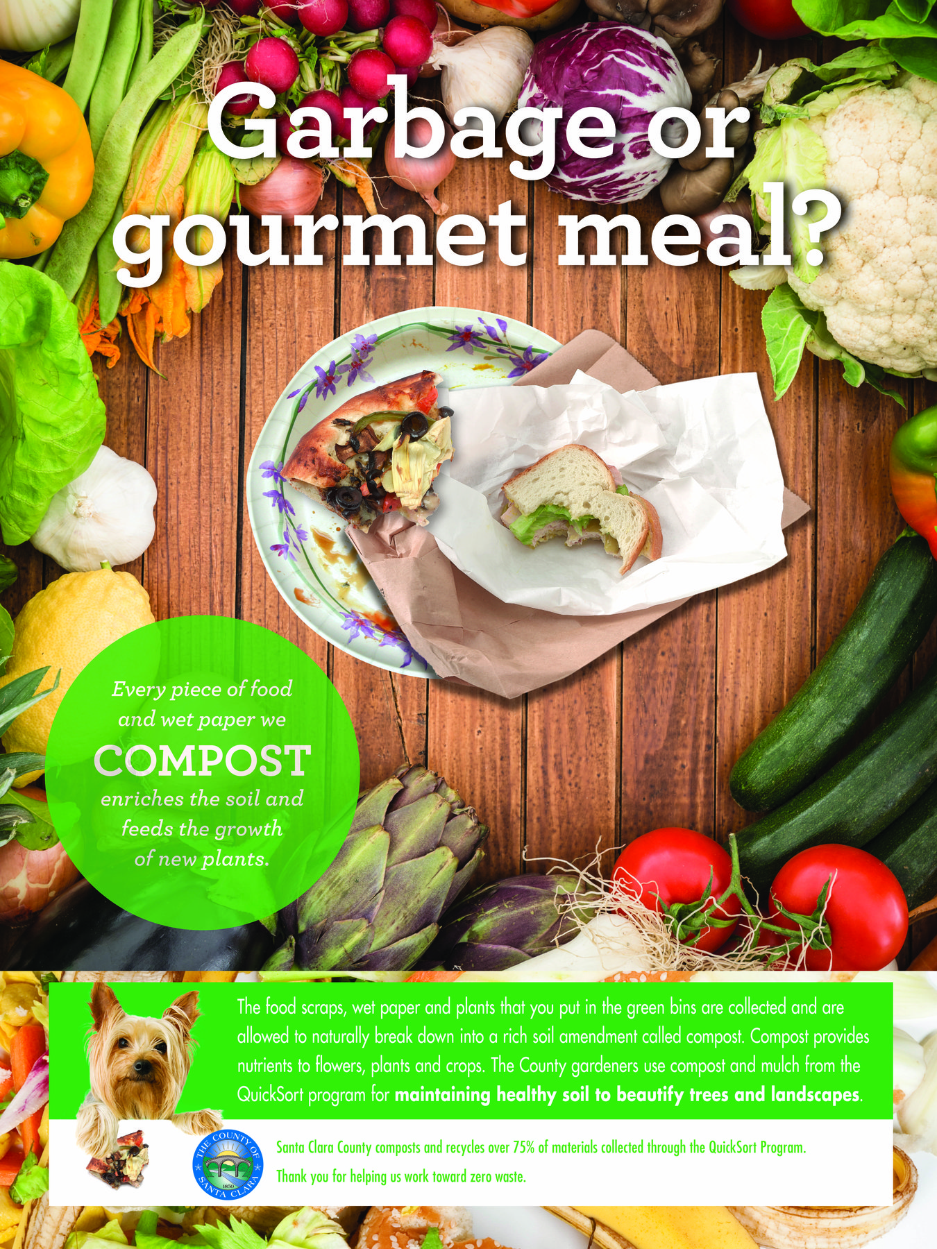
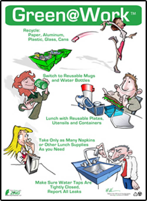
Here’s an example of one of our latest projects, for a government workplace recycling program. The project included both instructional and inspirational pieces, which were displayed separately to increase their impact. Here is one of the inspirational pieces.
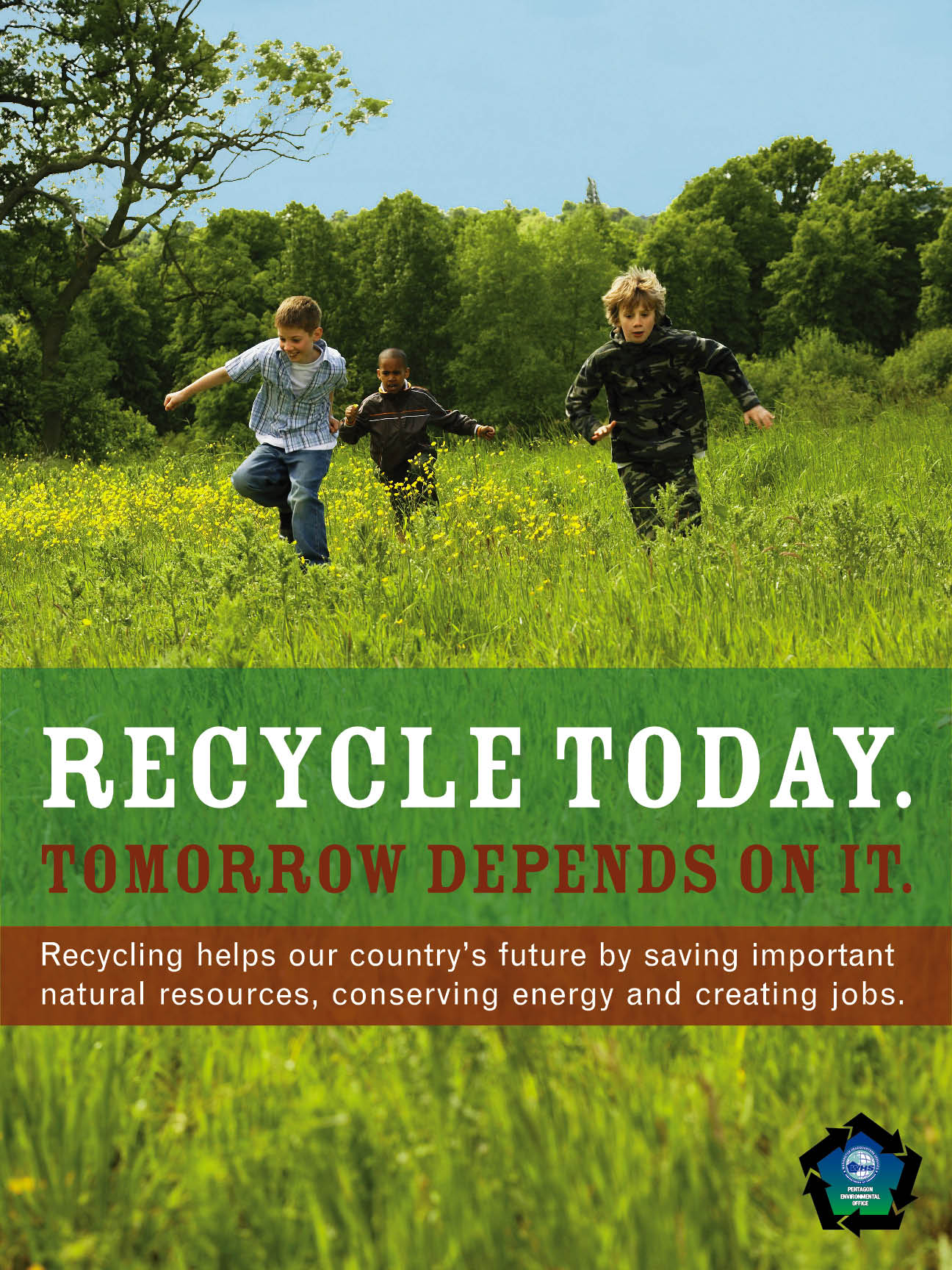
Here’s another example, done for the Pentagon, which uses an emotional connection tailored specifically to the men and women charged with the security of the nation:
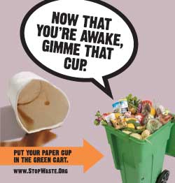
And this campaign, done by another advertising firm for StopWaste, a public agency, is a great example of using humor to engage viewers:
Wouldn’t you say these examples above have a better chance of increasing participation than a sign, like the one below, that merely tells us what to do without explaining why?
We know it’s not always easy to be captivating, but given the myriad messages that people are bombarded with every day, it’s more important than ever for government communications about environmental programs to offer more than just instruction. Government communications should include vibrant, contemporary images and catchy concepts to increase the receptivity of the message and therefore, the effectiveness of the outreach.
There is a campaign in certain European and Scandinavian countries, and I believe here in the U.S. aimed (no pun intended) in getting the public to keep restrooms cleaner. Rather than hang signs or do PSAs, a small housefly decal is placed inside urinals and toilet bowls. This small and inexpensive, not to mention humorous, design tweak brings about significant improvement in behavior, at least in the men’s bathrooms.
Great example, Michele! Makes doing the right thing into a game…as long as no flies are harmed. 🙂