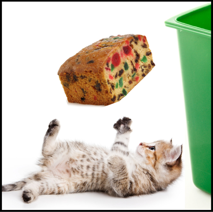
At Gigantic, we always try to be creative and light-hearted, so when it came time to send a New Year’s greeting to our email list, we decided to try something a bit different: a greeting with a link to a five-second poll, asking folks to vote on which of the two images (below) they would most likely click:
 Our greeting was sent to Gigantic’s email list and posted via Facebook and Twitter. We were delighted by the response: a 46% open rate on the email, a whopping 64% click-through rate, 101 poll votes and over a dozen comments on the blog. We know via Analytics that most of the visitors on January 6 (the day we published the poll) were new to our website, and that on average, folks stayed on our site nearly one minute — not bad for a 5-second poll!
Our original intent was to draw attention to the popularity of cat memes and to suggest that pop culture knows a thing or two about spreading ideas. Well, you surprised us. The winner is … Option A! Receiving 58 percent of the votes, this more serious image showed a stale fruitcake going into a typical organics pail for composting. The adorable kitty, juggling the fruitcake before tossing it in the bin, garnered only 42 percent. This startled us on several counts (we thought the kitty was cute and was the obvious choice for attracting more eyeballs), and as we analyzed the results, we drew several lessons:
Clarity matters. Several comments argued that more specificity was needed in the kitten image, noting that it wasn’t clear that the fruitcake was destined for the bin in Option B. Our text asked two questions: “Which image are you more likely to click?” and then “Which image do you find more memorable and effective for getting out the food scrap recycling message?” In hindsight, we realize that combining “memorable” and “effective” confused the issue. Our intention was to illustrate the importance of getting attention before providing information; our wording needed work. Which leads us to:
Testing matters. Had this been a “real” campaign, we would have spent a lot more time designing our objectives and creating alternative messaging. Ideally we would have run a pilot, testing images, messages and the manner of distribution to match the kind of data we wanted to elicit.
Engagement matters. Before we can deliver any message, we have to cut through the “noise” and get attention. The volume of response, via email opens, click-throughs, and blog comments, far outran previous e-blasts to our clients. Frankly, this was one of our goals: to test how and if we could stand out amid the dozens of emailed New Year’s greetings. We focused on a short, punchy subject line that emphasized a time-limited response and a request for assistance (“help our research by taking this 5-second survey”). This probably aided our open and click-through rates.
Once we drew visitors to the blog post, we included the kitten picture as a way of drawing the eye, because we know the best messaging in the world won’t get through if we can’t attract attention. While the image in Option A may have been more clear, we note that much of the reaction centered around the kitten. Does this mean we’re suggesting that everyone should use kittens in their recycling campaigns from now on? Not at all. But paying attention to what’s “hot” in pop culture could yield some great outreach ideas that might lead to an increased waste diversion rate (or whatever your particular goal is).
As with all campaigns, we resolve to take this learning and build upon it for future efforts. Thanks to all who voted, and may your 2014 be filled with fun and effective green behavior change campaigns, with or without kittens!
Selected comments:
[table id=1 /]