5 Tips to Turn Your Environmental Outreach from “Meh” to “Magnificent”

The (bruised) bananaphone connects the Gigantic staff at CRRA

It’s easy to fall into a rut with environmental outreach tools (websites, brochures, bill inserts, how-to-recycle guides, etc.) But even the smallest touch-up can really help make a piece become more effective. In preparation for the recent California Resource Recovery Association (CRRA) annual conference, the Gigantic team put out a call to our email list, asking for samples of outreach materials that were ready for a makeover. We selected two submissions – the City of Fremont’s multi-family recycling guide and the Conservation Corps North Bay’s services flyer, and got to work.

See the results in the presentation below. In doing these makeovers, a few key takeaways emerged that we’d like to share:

1) Tailor by Audience – Often agencies and organizations don’t have the resources to make separate pieces for each audience (for example, multi-family building residents and property managers), but you can use visual cues and wording to clarify to whom you are speaking within a piece.

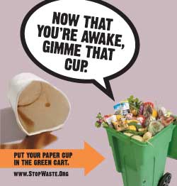
2) Give a Clear Call to Action – Laundry lists of do’s and don’t’s can make people’s eyes glaze over. Single, clear action steps are more likely to get results.

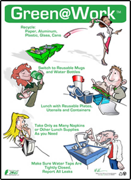
3) Use Clear Instructions – There are some best practices for information such as waste sorting guides: use color coding, group images by type, and don’t overlap images – the brain takes in the shape of an uncluttered image and retains it better.

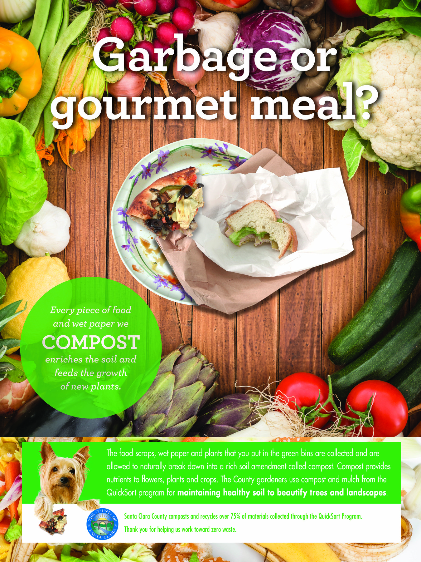
4) Tell Your Story – Stories stick. Make your messages come alive with vivid words and images, and beware of jargon and “internal speak.” Investing in custom photography with “real” community members pays off, as people see themselves in your outreach and are more likely to respond.

5) Be Consistent and Multi-Touch – No single brochure, no matter how well designed, can do all the work. Your message will go farther when all communication pieces work together visually and verbally, reinforcing your message across channels.

If your organization needs an outreach makeover, feel free to contact us and let’s see what we can do together!

Using Graphic Design to Win Hearts and Minds: Is it Possible for Government?

Man with mobile phone.According to the U.S. government’s own definition, graphic designers “create visual concepts, by hand or using computer software, to communicate ideas that inspire, inform, or captivate consumers.”

But how often do government communications actually inspire or captivate?

Our clients often say they want to “educate” or “inform” residents about their program. But in behavior change, we know that merely providing information does not guarantee action. We know we need to inspire and persuade — not just inform — and design plays a big role in meeting this challenge.

That said, we acknowledge there’s a time and place for just providing information, such as rate increases or service changes. In these cases, direct mail of a simple letter in an official envelope is the best way to cut through the clutter.

But when it comes to increasing participation in programs — from recycling and composting to planting trees — government should give creativity free rein. Here government agencies need to establish an emotional connection with the audience to overcome old habits, win over hearts and minds, and inspire change.

But wait, you say, “we need to look like we’re being responsible with taxpayer [or ratepayer] money, so we can’t do anything flashy or frivolous.” At Gigantic, we firmly believe there is a creative solution that is both engaging and appropriate, for every type of environmental campaign funded by public agencies. In fact, we’d argue that you could be wasting taxpayer money by not making it captivating. If no one notices your outreach, there’s no point in doing it.

And, we’d argue that a human-centered, thought provoking and positive concept — presented through a clutter-free design with professional imagery — has the best chance of attracting fans to your programs.

Here’s an example of one of our latest projects, for a government workplace recycling program. The project included both instructional and inspirational pieces, which were displayed separately to increase their impact. Here is one of the inspirational pieces.

food scrap recycling

Here’s another example, done for the Pentagon, which uses an emotional connection tailored specifically to the men and women charged with the security of the nation:

SCS_Pentagon1

And this campaign, done by another advertising firm for StopWaste, a public agency, is a great example of using humor to engage viewers:

122151292008cup

Wouldn’t you say these examples above have a better chance of increasing participation than a sign, like the one below, that merely tells us what to do without explaining why?

gaw

We know it’s not always easy to be captivating, but given the myriad messages that people are bombarded with every day, it’s more important than ever for government communications about environmental programs to offer more than just instruction. Government communications should include vibrant, contemporary images and catchy concepts to increase the receptivity of the message and therefore, the effectiveness of the outreach.